Launching surveys is just one of the ways you’ll make sure you’re getting the feedback you need to put out a great product. Instabug is loaded with different types of surveys, and you can boost their effectiveness by customizing them to your own brand and experience. There are custom surveys, NPS surveys, and app rating surveys, plus in-app announcements. Each one of these will be best when outfitted with your look.
So let’s get down to the details! In this post, let’s look at how you can customize the UI of your Instabug surveys to suit your app and add a welcome message to get more responses.
In-app surveys are one of the most effective ways to collect product feedback. To maximize your responses, you’ll want to match your survey interface with the rest of your branding.
Custom surveys that incorporate seamlessly with your app experience will be more successful as they offer a more immersive, native experience. If your survey look and feel is inconsistent with your branding, it erodes user trust and undermines your brand.
Choose your theme
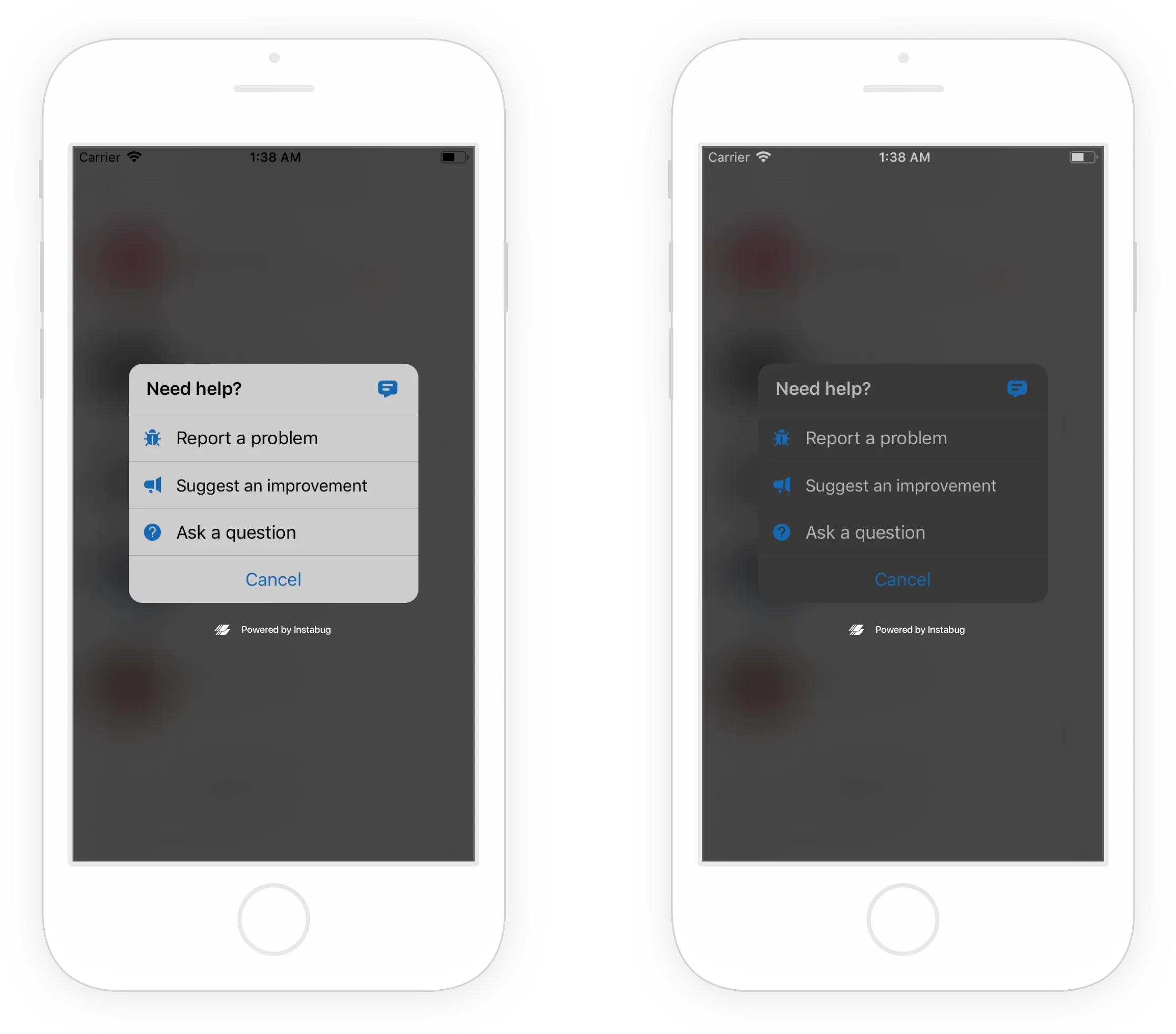
You’ll want to start by customizing the overall SDK theme if you haven’t already. That will make sure that Instabug fits right in with your app experience. The interface has two different color theme options — choose from light or dark.

Here’s the code snippet you’ll use to choose your theme:
iOS
Swift
Objective-C
Android
Java
Cross-platform
And here’s how to change the theme on your cross-platform app:
Read on below to see how you can further customize by choosing your primary color.
Set your primary color
Your primary color will be the color users will see on your icons, interactive items and call to action buttons. This pop of color will help tie Instabug in with the rest of your app.
Use this method to set your primary color:
iOS
Swift
Objective-C
Android
Java
Cross-platform
Here are the snippets for your cross-platform app:
Floating button options
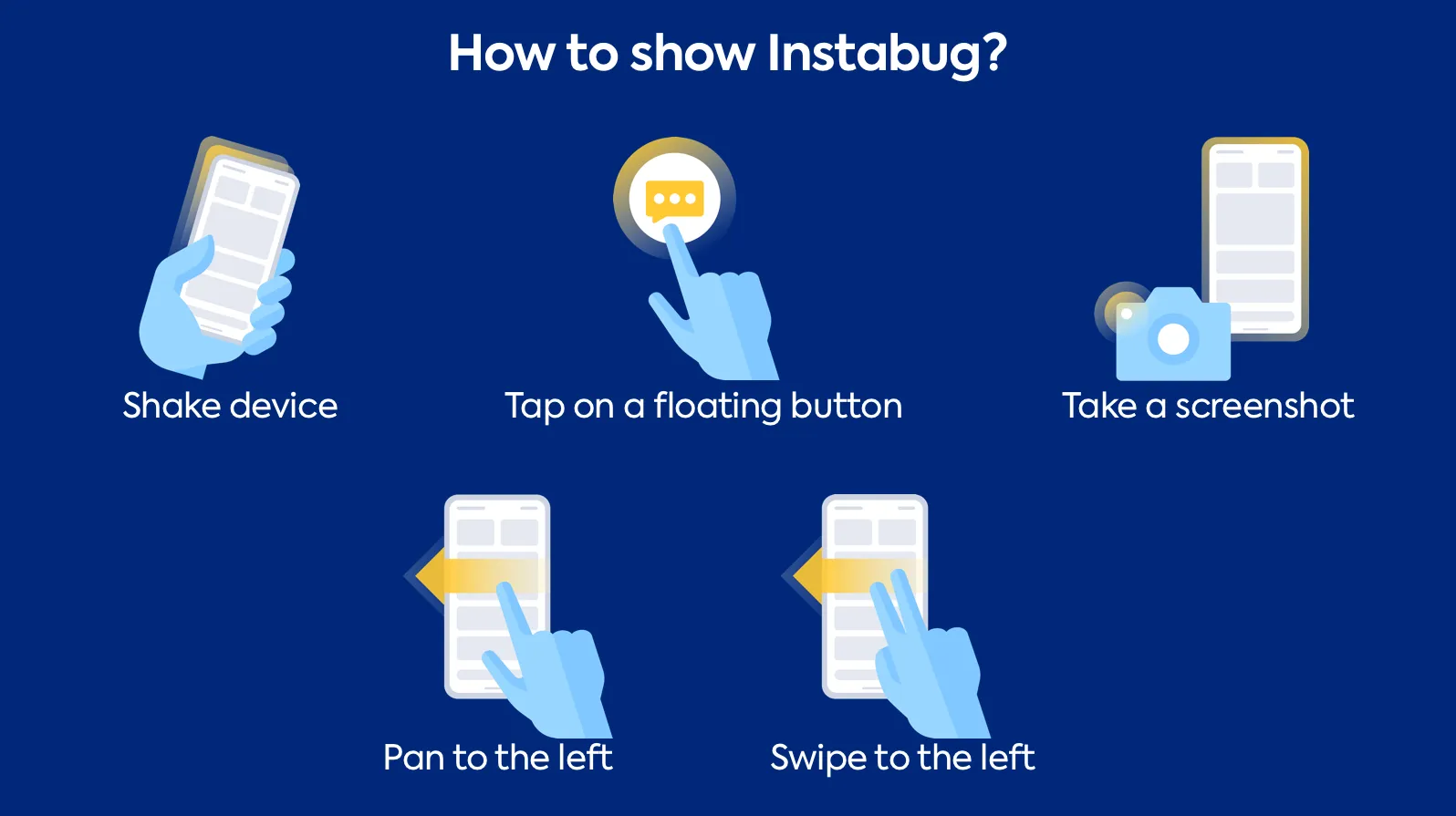
There are many ways for your users to invoke Instabug, which, by default, starts with a shake of the phone. If you’ve chosen to use a floating button instead, you can also customize your button color and position on the screen.

Here’s what you’ll need to customize your floating button:
iOS
Swift
Objective-C
Android
Java
Cross-platform
For cross-platform apps, check out the snippets here:
For more tips on maximizing your survey effectiveness, check out our in-app survey guide.
Learn more:
- Getting Started With Instabug Surveys
- How to Segment Audiences and Target Mobile App Surveys With Instabug
- Survey Localization for Mobile Apps With Instabug
- How to Respond to Survey Feedback About Your App
Instabug empowers mobile teams to maintain industry-leading apps with mobile-focused, user-centric stability and performance monitoring.
Book a demo to see how Instabug can help your app


